Bud Light Unveils New Look but Fails to Acknowledge That It's What's on the Inside That Counts
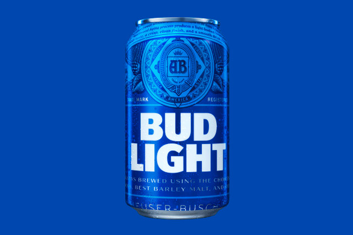
The new blue label, which is bringing back the brewery’s “AB” crest for the first time since 2001 (gasp!) “truly stands out from what’s become a sea of sameness in the light beer category,” says VP of Marketing Alexander Lambrecht. No word on whether he was just talking about the packaging or if he was including the taste of Bud Light in that statement.
Tosh Hall, creative director at Jones Knowles Ritchie, said of the new packaging that “Bud Light is leaning into its heritage and unrivaled brewing expertise in a way that’s looking forward, not back.” That is to say, they look forward to buying up more craft breweries to desperately try to legitimize their product in a growingly craft-centric market rather than improve on their own or learn to do it for themselves.
The most exciting part of all of this is that Bud Light has promised to unveil a new tagline and creative approach in time for Super Bowl 50—so hopefully they won’t talk trash about any of the breweries they just bought up or insult any of their new employees in their commercials this year.
What the whole thing comes down to, though, is that if you’re an asshole and you change the style of clothes you wear, you’re still an asshole. Bud Light will still be a terrible beer no matter what the cans look like, so good for them for having the money to waste on a rebranding that will have minimal results.
Photo via Anheuser-Busch
Tags: Beer


